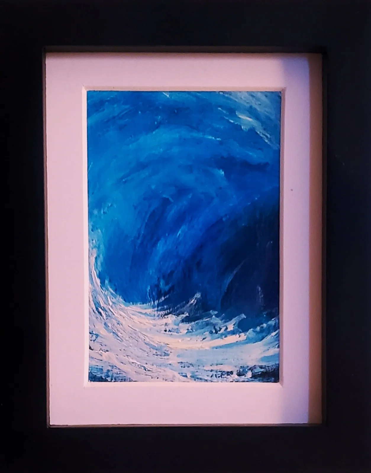
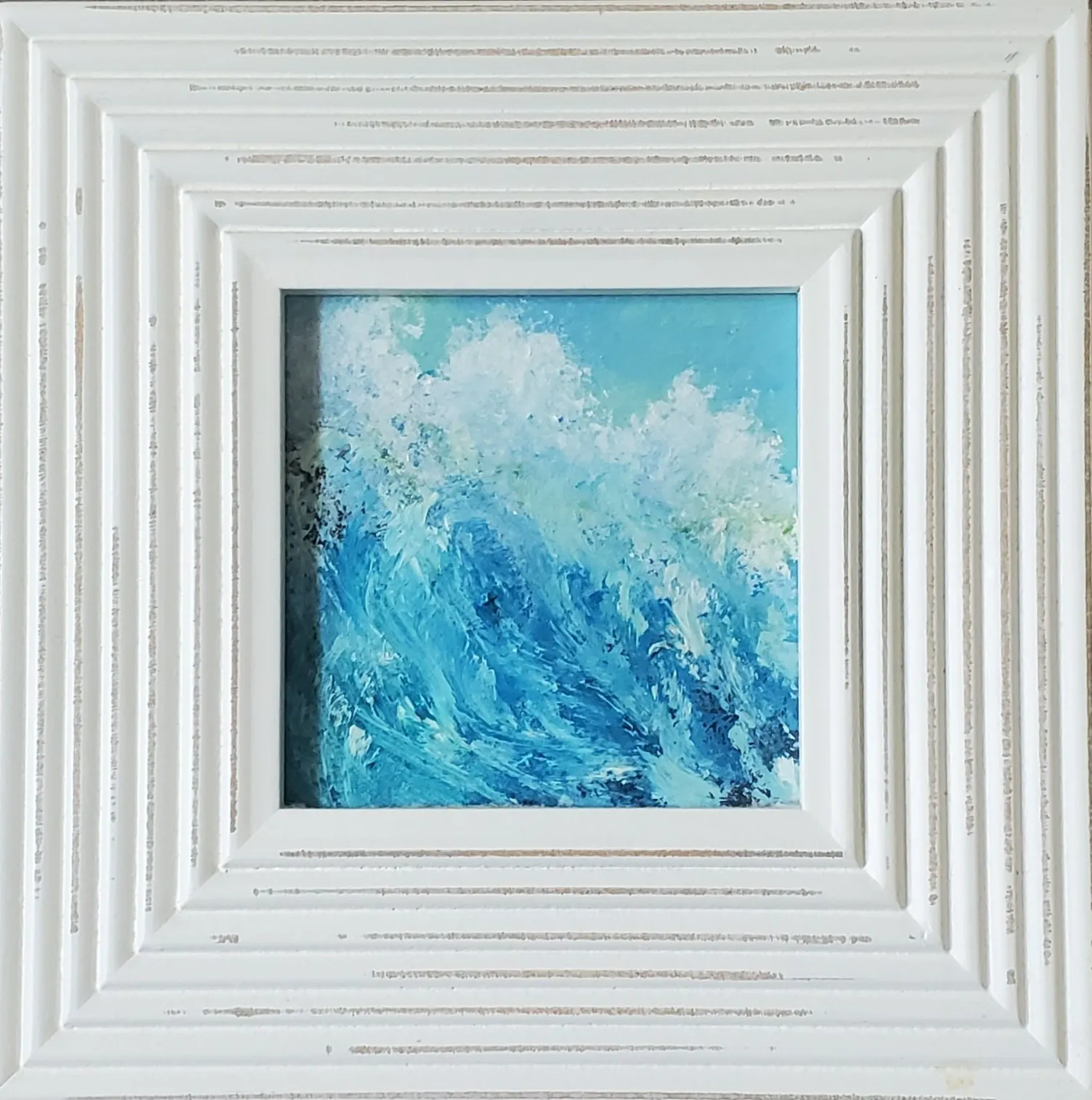
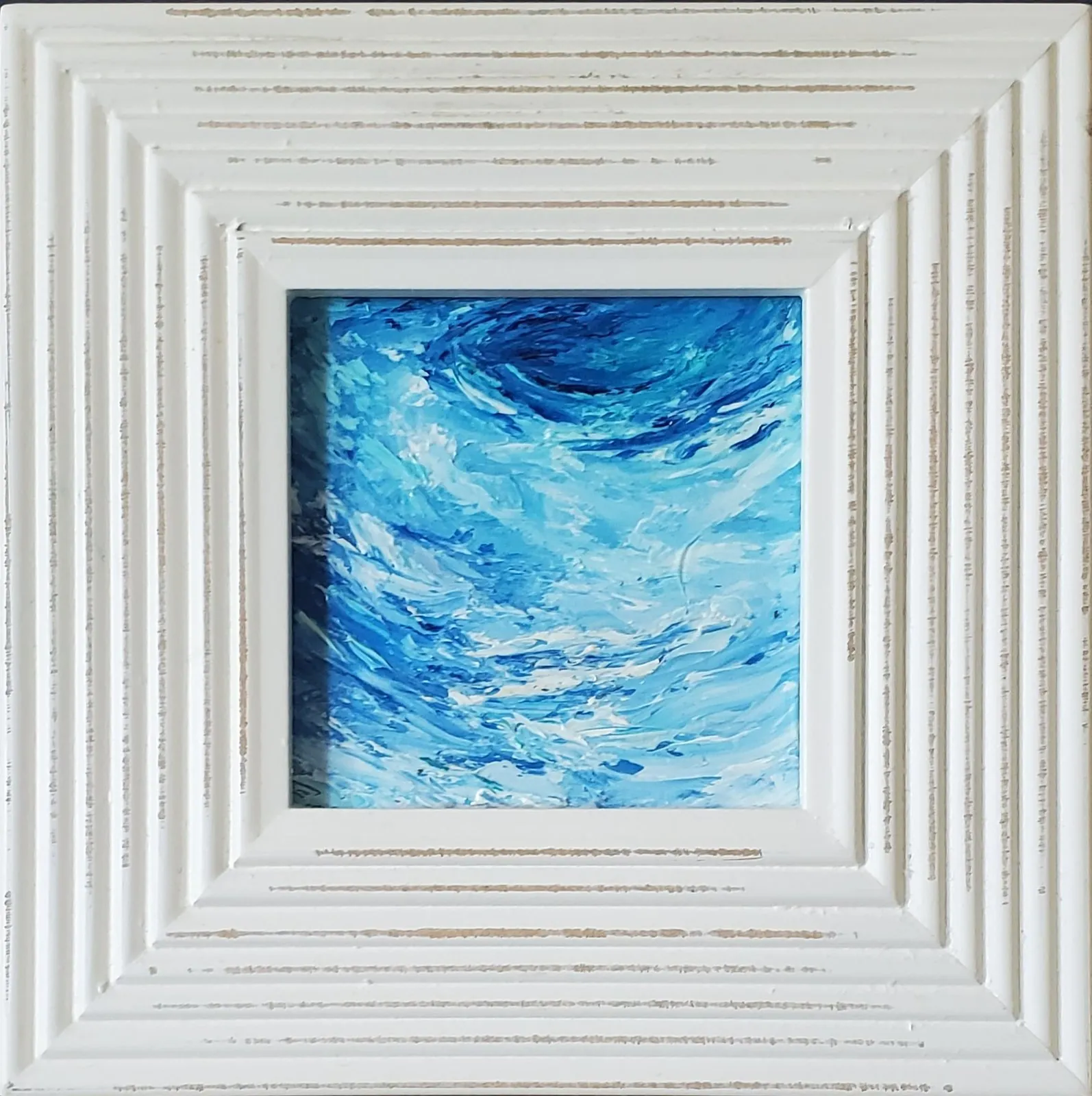
A good first response is often enough. You may be drawn to the lighter edge of a curling wave, the darker weight of open water, or the sense of motion inside a small patch of blue. Let that response lead. A seascape painting does not need to match every object in a room. It can simply give one wall a horizon, a rhythm, or a little more air.
Once a few paintings stand out, consider where you will see them most. Small originals work beautifully in places where attention slows down: near a reading chair, above a desk, at the end of a hallway, or in an entry where a bright wave can welcome you home. Check the artwork page for the finished dimensions, especially when a painting is matted or framed. Taping out that outer size is a practical way to see how the work will sit in its new place.
The light around the work will matter, too. Strong blue may feel cooler near a window and richer under a warm lamp. Oil texture can become more visible in an evening room, while a brighter surf painting can carry daylight further into a corner. There is no fixed rule for placement. Give the piece enough space to be seen, and let it become a small part of the way the room changes through the day.
A seascape can also make an interesting beginning for a more personal collection. Pair it with a landscape for two different kinds of distance, or place it beside an abstract that picks up the same color energy. The connection does not have to be obvious. A collection grows well when each painting gives you a different reason to pause. One small ocean view may be all a space needs, or it may be the first piece that shows you what to look for next.